2010-01-23
Subscribe to:
Post Comments (Atom)
Although the universe is ablaze with more colours than the human eye can detect, we can also learn to see the world in new ways by returning to the roots of the art of photography, to the art of black and white, and other monochromes like sepia (and bi-level). This photo blog celebrates that spectrum of colours ranging from the darkest monochromes to the most brilliant whites, and everything in between.
5 comments:
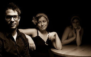
Lovely lighting, though I would prefer a bit more light on the third model, just a touch more. I like the use of hands. You usually have a story in mind, what? And lovely tones of sepia.
Interesting. I'll have to show you some others where she's lighter (though I can't show them here, because she's more obviously nude in those).
No story here -- just a bit of surrealism, playing with the layering of light, and experimenting with what grabs our eye -- on the one hand Molly is the darkest and farthest and hardest to see; on the other hand her nudity grabs our attention. Somewhat the same with the other photo: newspaper guy close and in focus, but distant nude competes for attention.
Don't think my friend Ned would have posed nude anyway -- but I could ask... Then I'd probably have to pay him.
Ken, what is your sepia mix here. I like its depth and richness. It doesn't remind me of any of the presets in Lightroom 2, but my memory is not great. This mix works for both the darkest and lightest areas.
The sepia part is just the "Sepia" preset in Lightroom 2 -- no trick here; click on "Sepia". :-)
However, as always, I spent a lot of time AFTER the sepia stage working on curves. That -- not the toning -- is why the darkest and lightest areas are dark and light the way they are.
The lighting, by the way, is a 2x2' softbox with an "eggcrate", a fabric grid that makes the light fall off rapidly to the sides. It's positioned very close, just above the top of the frame, and about a foot to the right of the guy's face, and pointed straight down. Close positioning also makes the light fall off rapidly as the subjects get farther away -- when the light's one foot away from one subject and three feet away from another, the inverse square law means there's only one ninth as much light on the second subject as on the first, a three-stop difference.
Post a Comment